Rebranding: There’s More Than One of Everything
Visuals and how we perceive and interpret those visuals is a very important trait/skill we humans have, it differentiates the blue collar workers who prefer plaid shirts, to art connoisseurs who prefer a Rembrandt. Branding is based on this basic fundamental, visually appealing and consistently detailed symbols we can associate to.
Branding is an important part of any businesses. It helps make them more recognisable to the public and can have a major impact on their reputation and how they are perceived by people. While we have started to see a huge uptake of rebranding projects in South Africa, we wanted to take another angle to projects and concepts, and add a little Fringe mythology to brands, in a manner of “there’s more than one of everything”, to showcase our own skills and a peek to how brands might have looked in some alternate universe. It’s not about opposites but how a different vision would have resulted in a different outcome based on our vision.
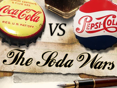
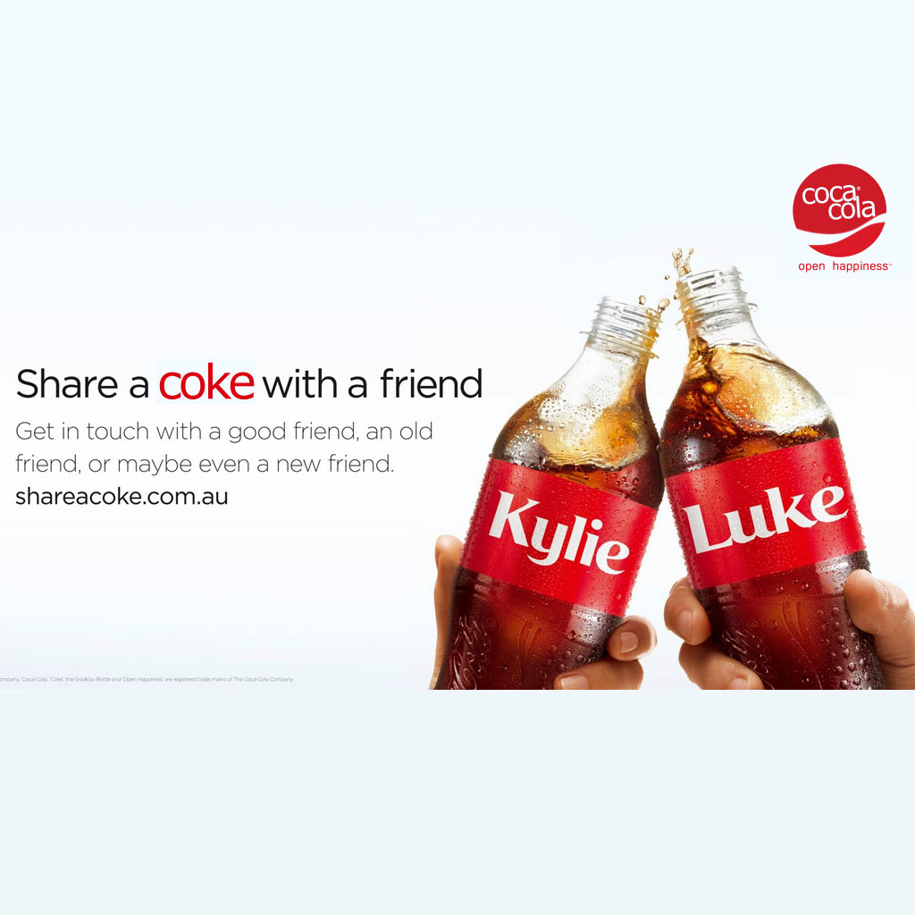
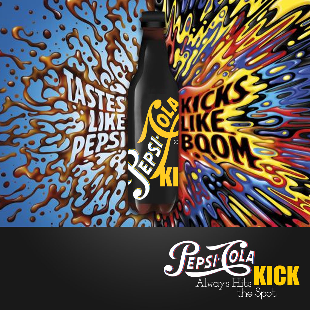
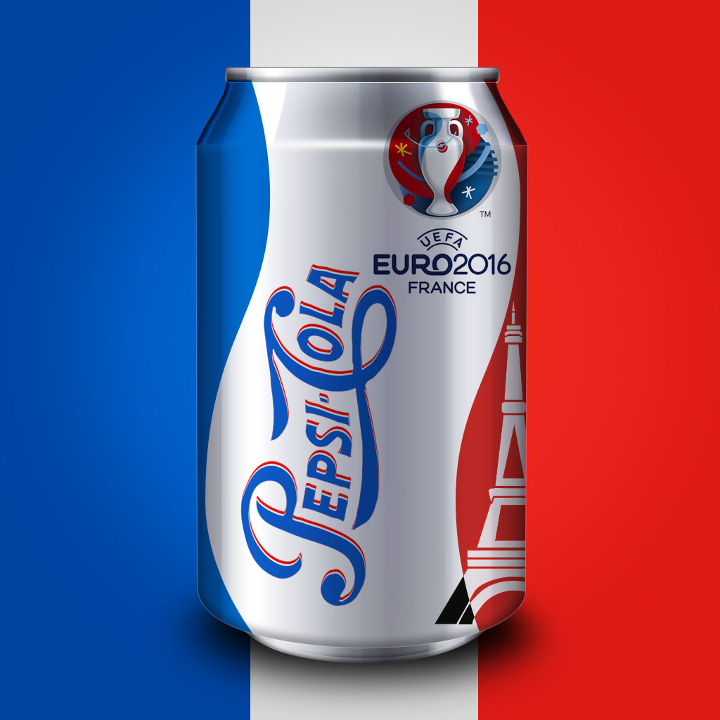
To kick it off we going with probably the oldest and most in your face branding face-off we’ve ever seen: Coca-Cola vs Pepsi. What motivated this concept? We sat back and thought “what if Pepsi had won the Soda wars and Coke had to play catch up?”. Pepsi is a huge brand no doubt and has regained a lot of market share, but as far as in your face brand placements, Coca-Cola still seems to be king (FIFA World Cup anyone?). So we switched it up and created brands based on Coca-Cola being the underdog that needed to rebrand to keep up with Pepsi-Cola. So here we go, for more on the Soda Wars click here
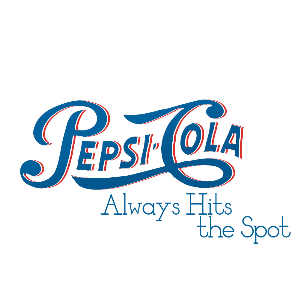
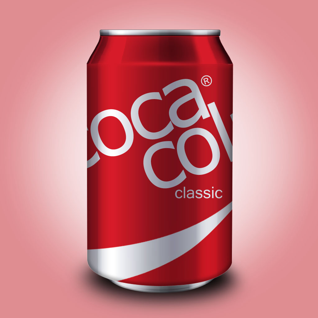
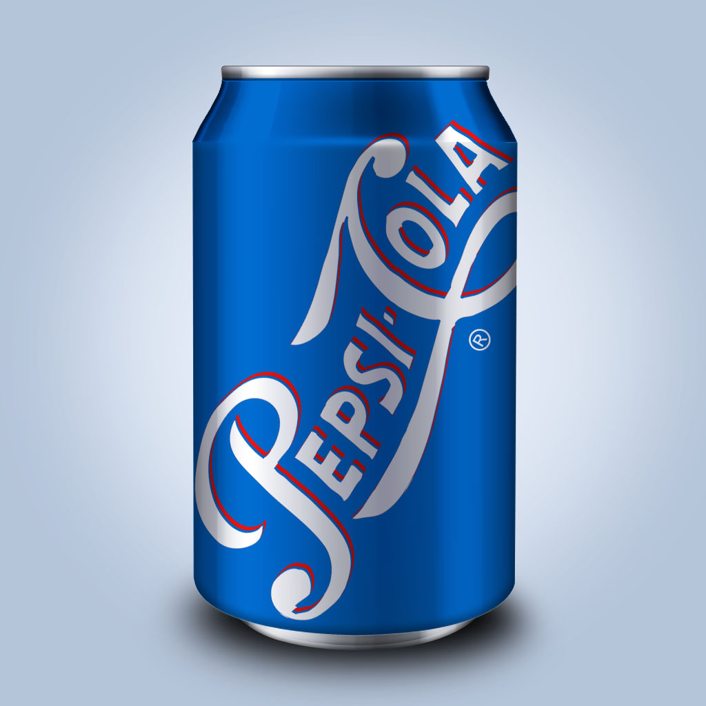
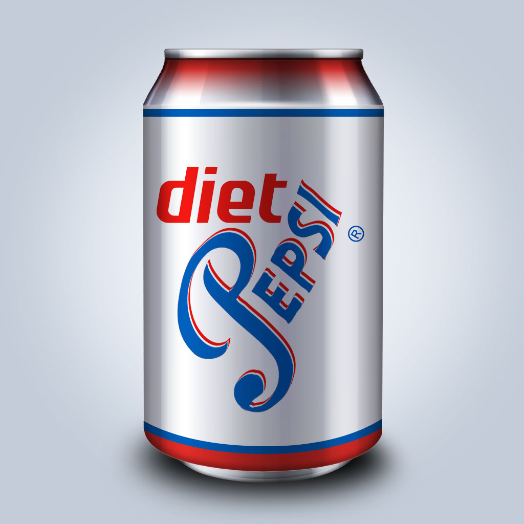
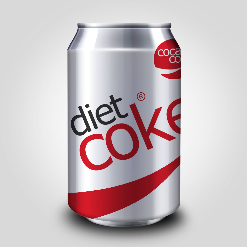
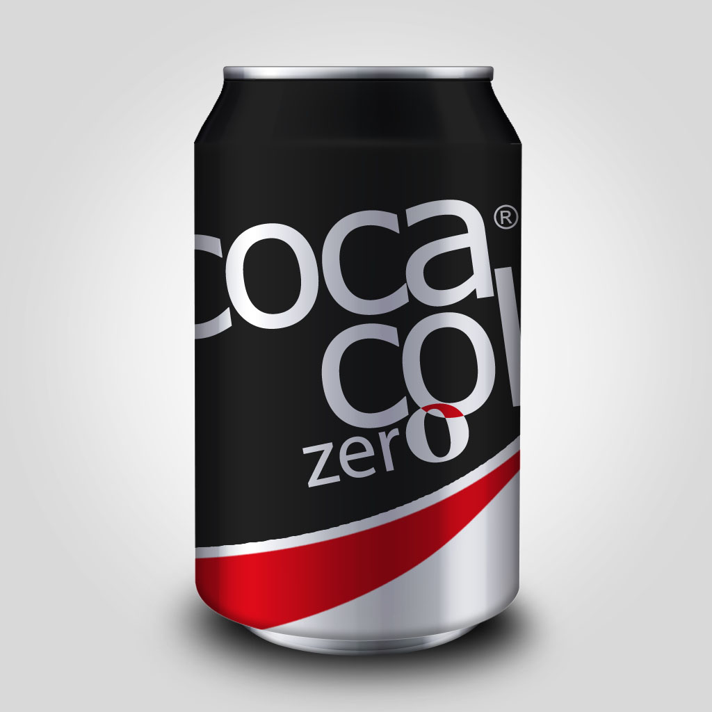
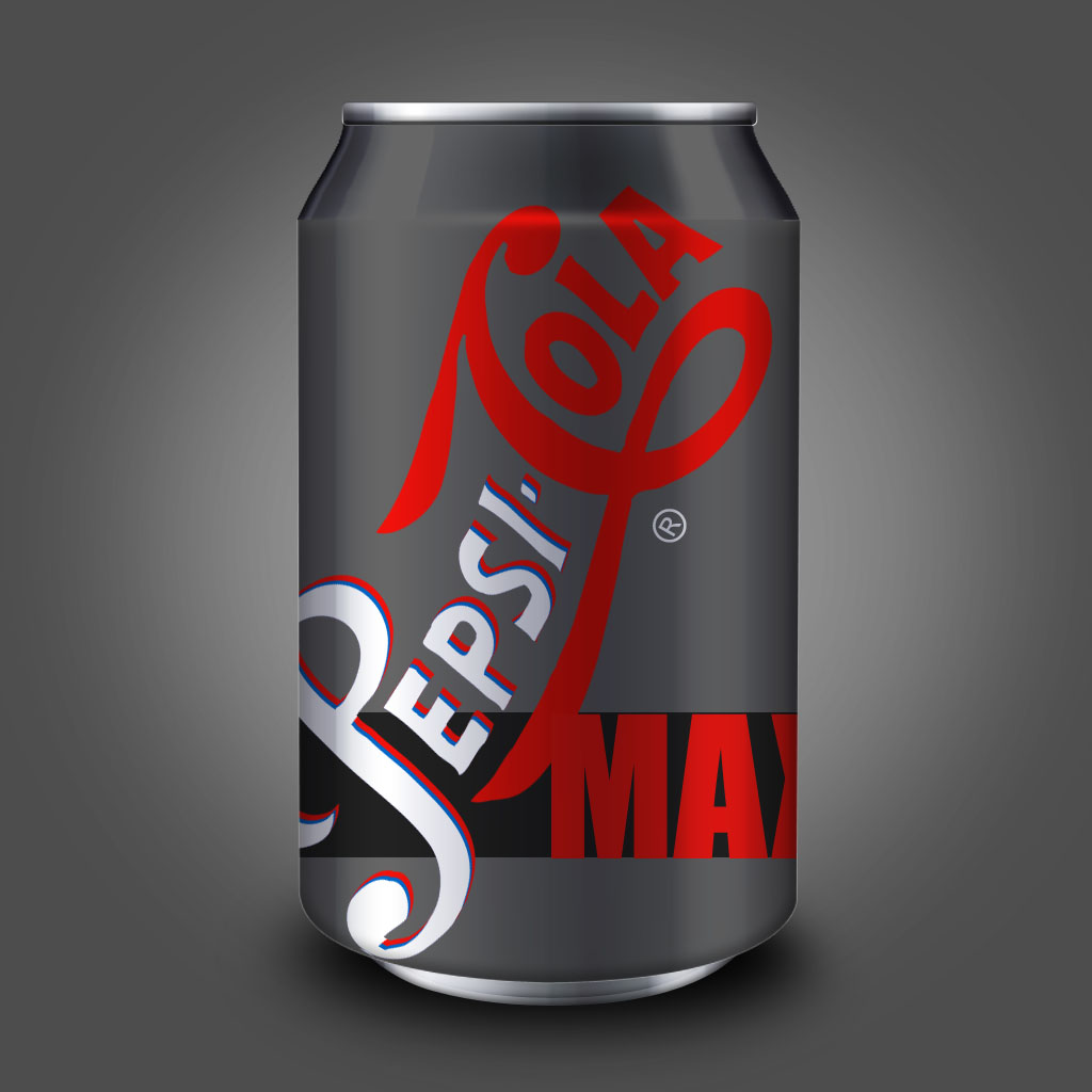
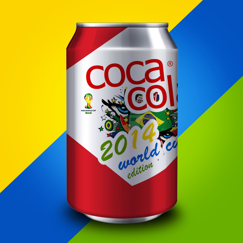
Note: Ads below are real world campaigns by both companies. Rebranded application are the only changes